Let's get started on something amazing.

I'm always excited to collaborate or chat about design ideas. Whether you have a project in mind, want to explore creative possibilities, or just want to share inspiration, feel free to reach out because conversations often spark the best ideas.

Want to email me?
monacographicdesign@gmail.com
Socials

Whispering Spirits is a premium yet whimsical tea brand inspired by Japanese folklore and the enchanting world of Yokai. The packaging blends elements of untamed wilderness with the mystical narratives traditionally shared around a glowing campfire, creating an atmosphere that feels both grounded and otherworldly.

This project served as a comprehensive exploration of package design, centered around the development of three unique canister concepts. Each design showcases a distinct flavor and creatively incorporates pop-culture influences, challenging me to merge narrative, visual design, and brand cohesion into a unified experience.

Inspiration

To begin for those who don’t know, Yokai are a class of supernatural beings and spirits in Japanese folklore. They encompass a wide range of creatures like monsters, demons, and ghosts. Typically these stories are solely supernatural events, but they are also cautionary tales for life lessons among both children and adults. So, I found that incorporating this interesting part of Japanese culture into the branding of Whispering Spirits would make it stand out among other beverages seen in a supermarket.

Design concept

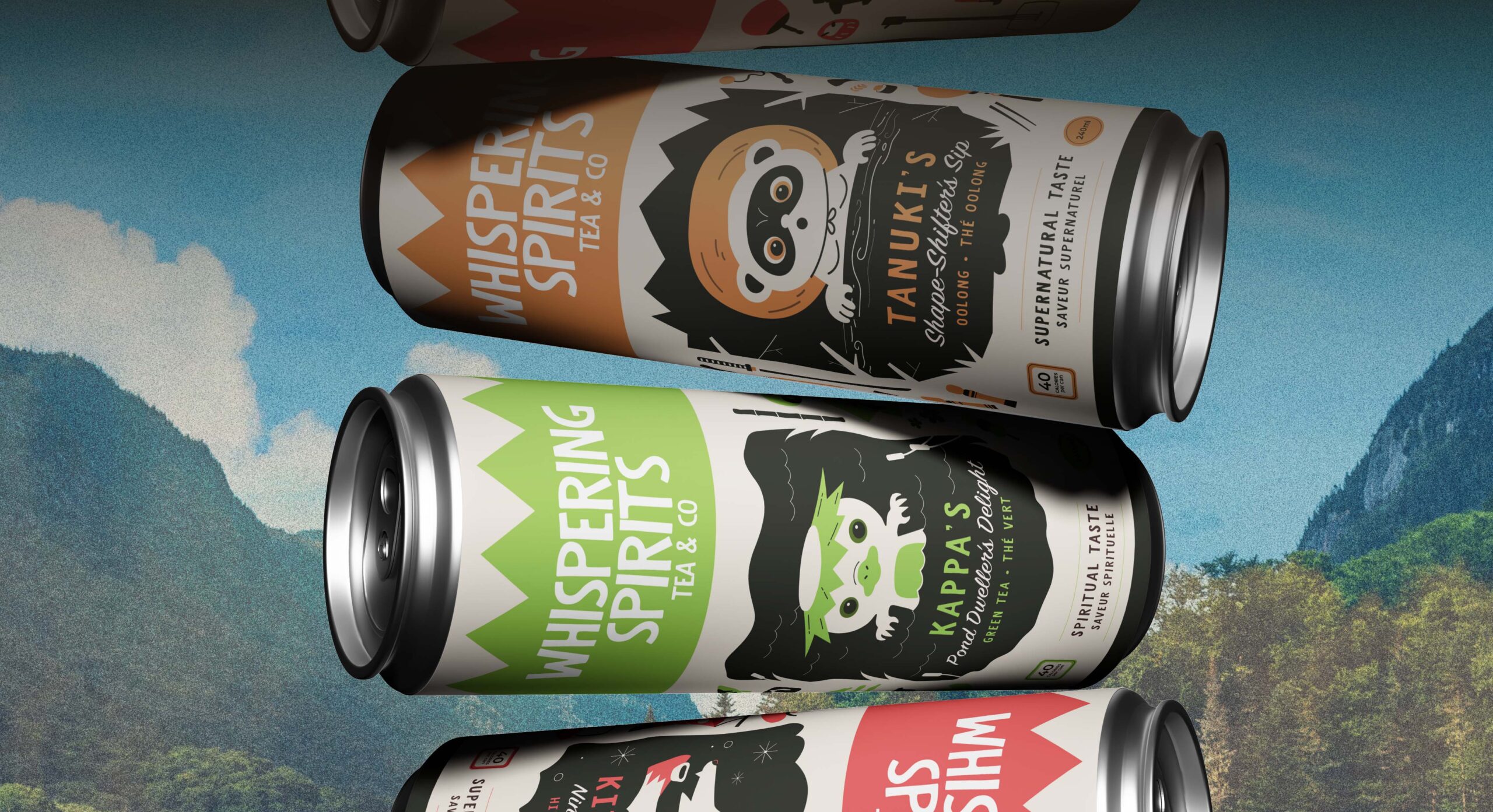
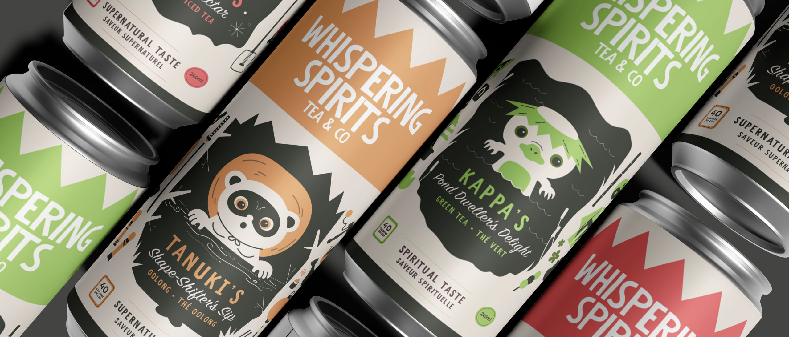
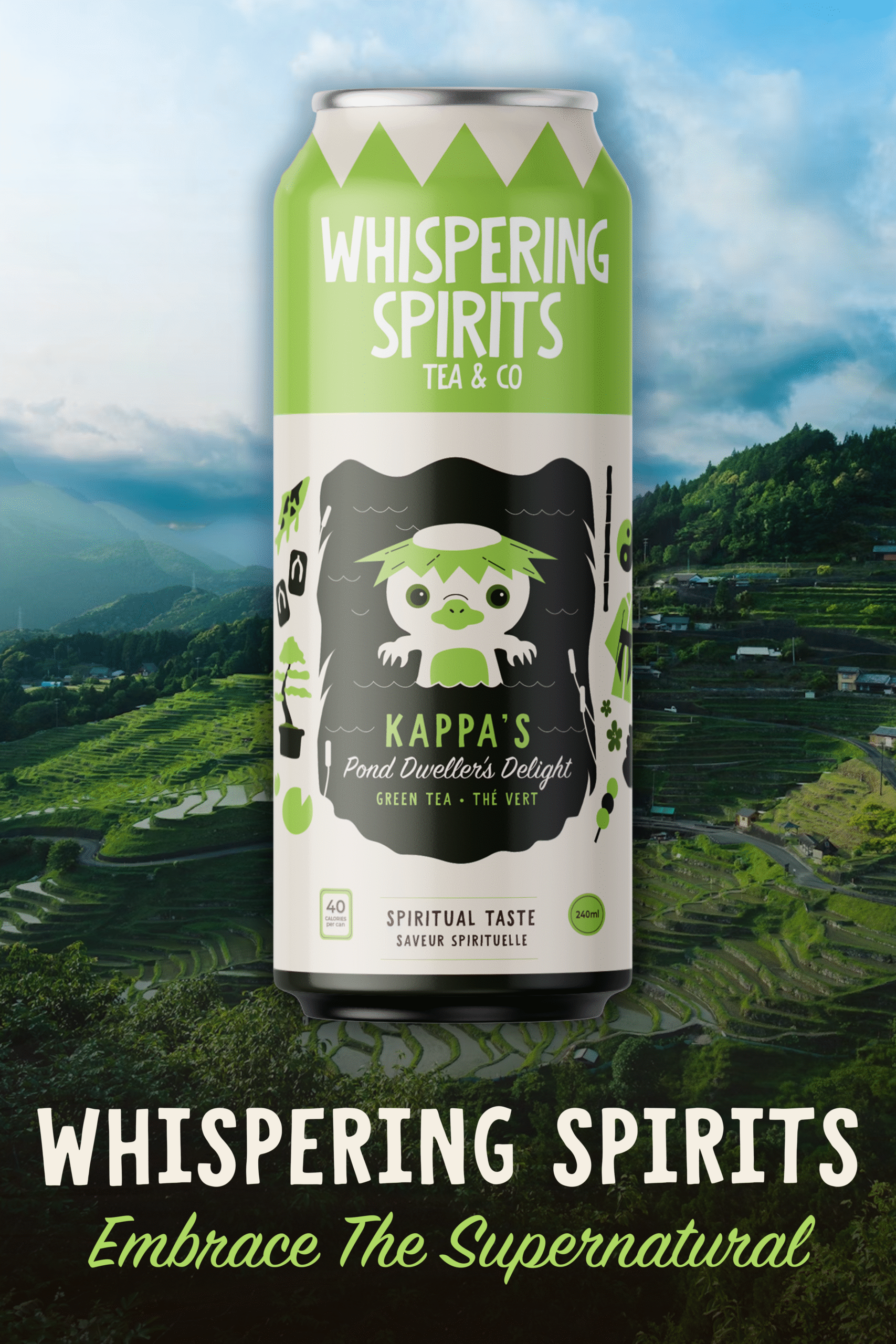
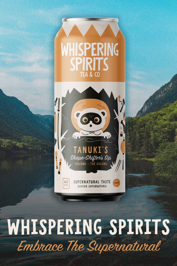
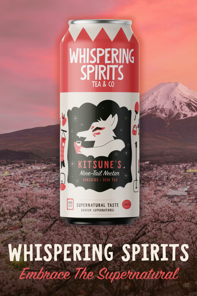
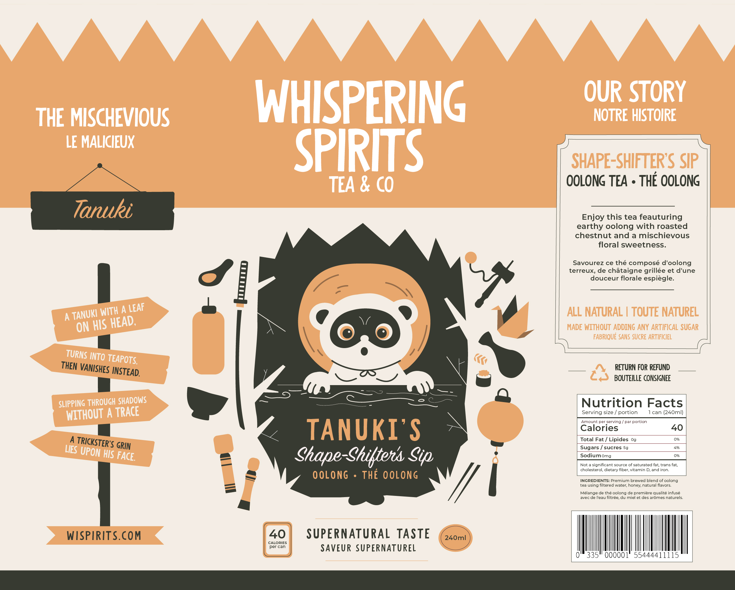
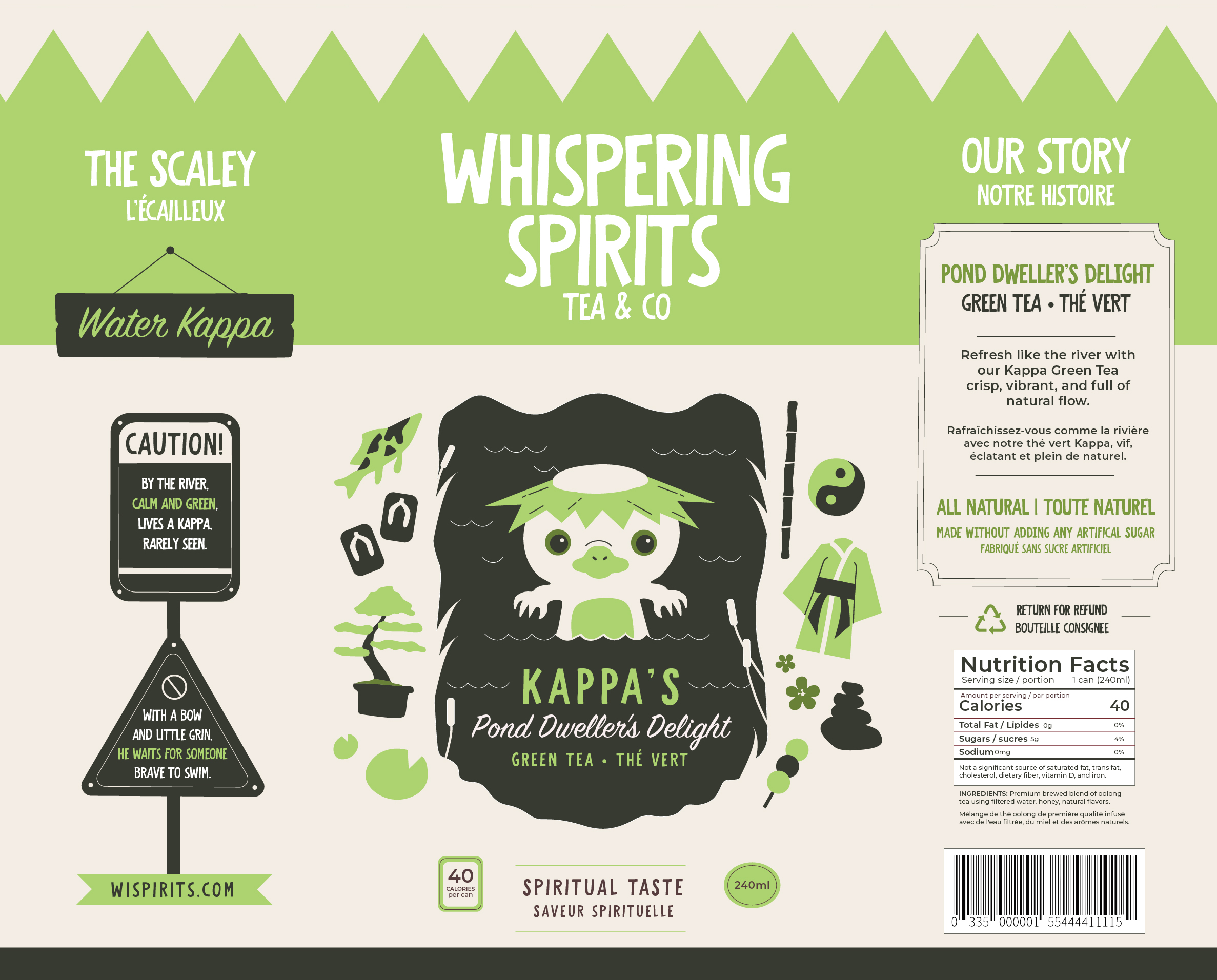
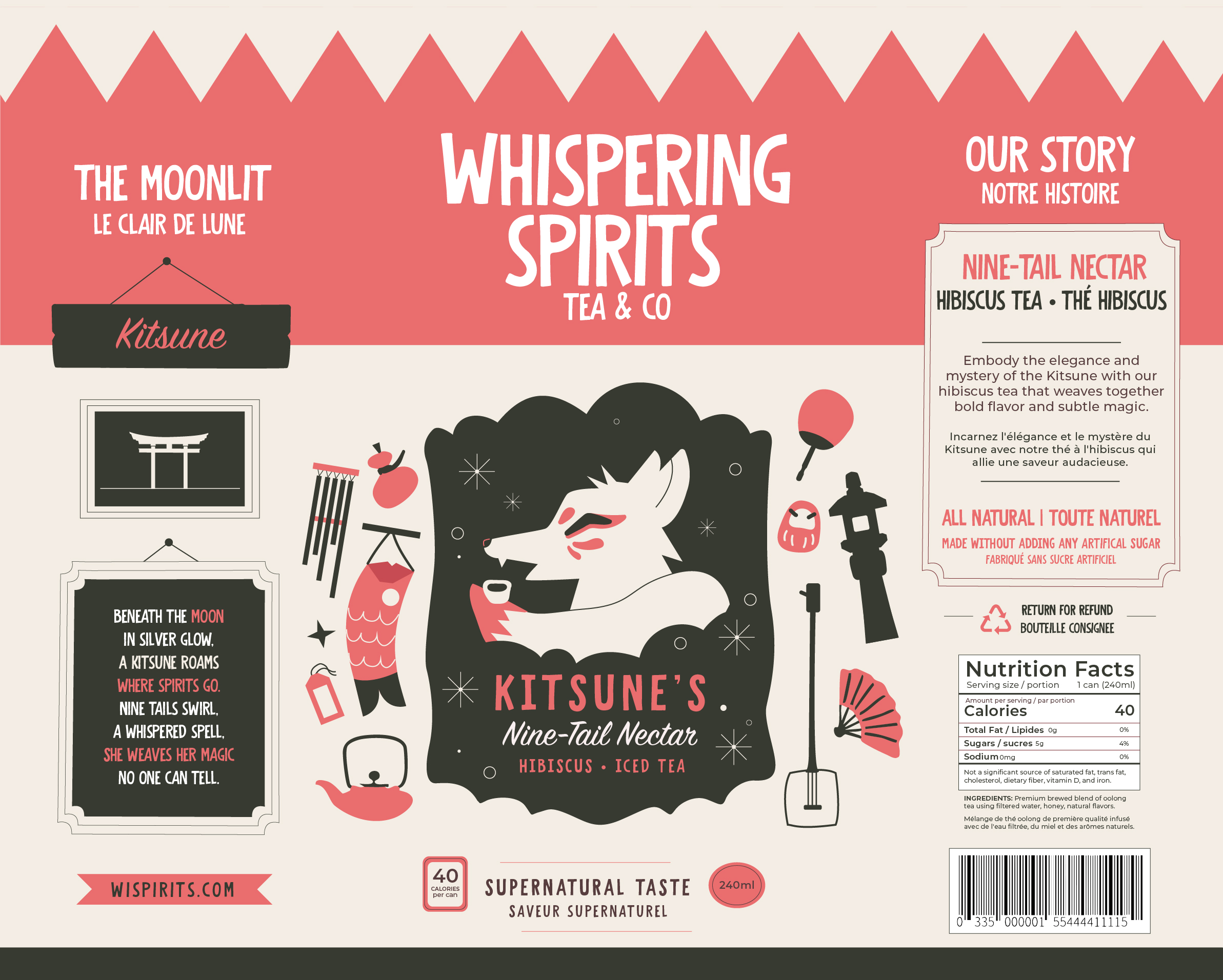
The tea cans feature three distinct flavors, each represented by a character inspired by cultural folklore. The Kitsune, Kappa, and Tanuki  were chosen because of their significance in current media such as anime and telovision.  The illustrations surrounding each character showcase symbolic items from their stories, turning the packaging itself into a visual narrative. By weaving folklore into the design, the cans celebrate cultural storytelling and highlight the origins and meaning behind these traditional tales.


For example, the Kappa-themed can incorporates elements of nature and river imagery. In folklore, Kappas are river-dwelling creatures known for luring swimmers into the water. While these myths were used at the time to warn children about dangerous rivers, their themes now provide a rich source of visual inspiration. Translating these narrative details into packaging design not only makes each can distinct and memorable, but also connects consumers to the cultural stories behind each flavor.

This project offered a meaningful opportunity to explore the intersection of design, storytelling, and cultural inspiration. Working with themes rooted in Japanese folklore pushed me to think more intentionally about how visual elements can honor tradition while remaining engaging and contemporary. Through developing three distinct can designs, I gained a deeper appreciation for narrative-driven branding and the power of thoughtful illustration in shaping a product’s identity.