Let's get started on something amazing.

I'm always excited to collaborate or chat about design ideas. Whether you have a project in mind, want to explore creative possibilities, or just want to share inspiration, feel free to reach out because conversations often spark the best ideas.

Want to email me?
monacographicdesign@gmail.com
Socials

For this project, I created a custom album cover inspired by the rich visual world of Twenty One Pilots. Their blend of storytelling, symbolism, and emotion shaped the direction of my design, guiding me toward a concept that captures the band’s signature balance of darkness, vulnerability, and hope. 

This cover serves as my personal interpretation of their universe—distinct, imaginative, and rooted in admiration for their craft. From their humble beginnings to their global influence, I wanted to celebrate their journey by reimagining one of their most iconic albums, Trench.

Inspiration

When most people think of a music video, they imagine the band performing—singing, dancing, and playing their instruments. Twenty One Pilots goes far beyond that. Their videos build an entire fictional universe shaped by themes of resistance, vulnerability, and self-discovery, brought to life through distinct characters, vivid visuals, and layered symbolism.


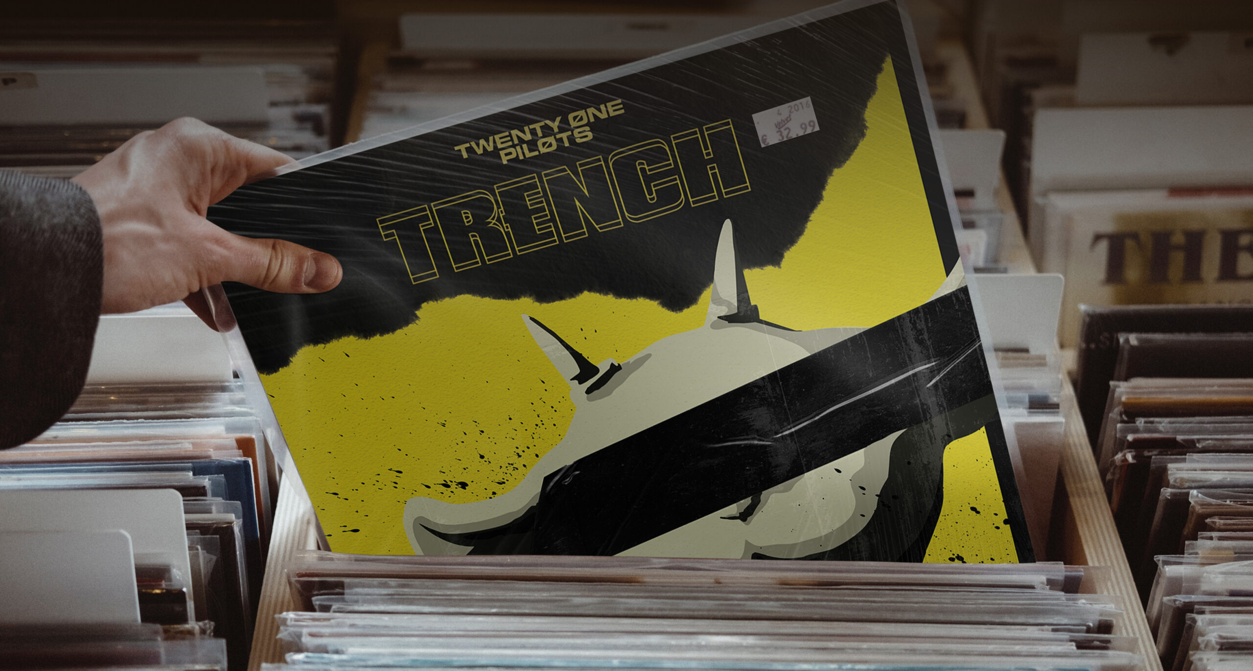
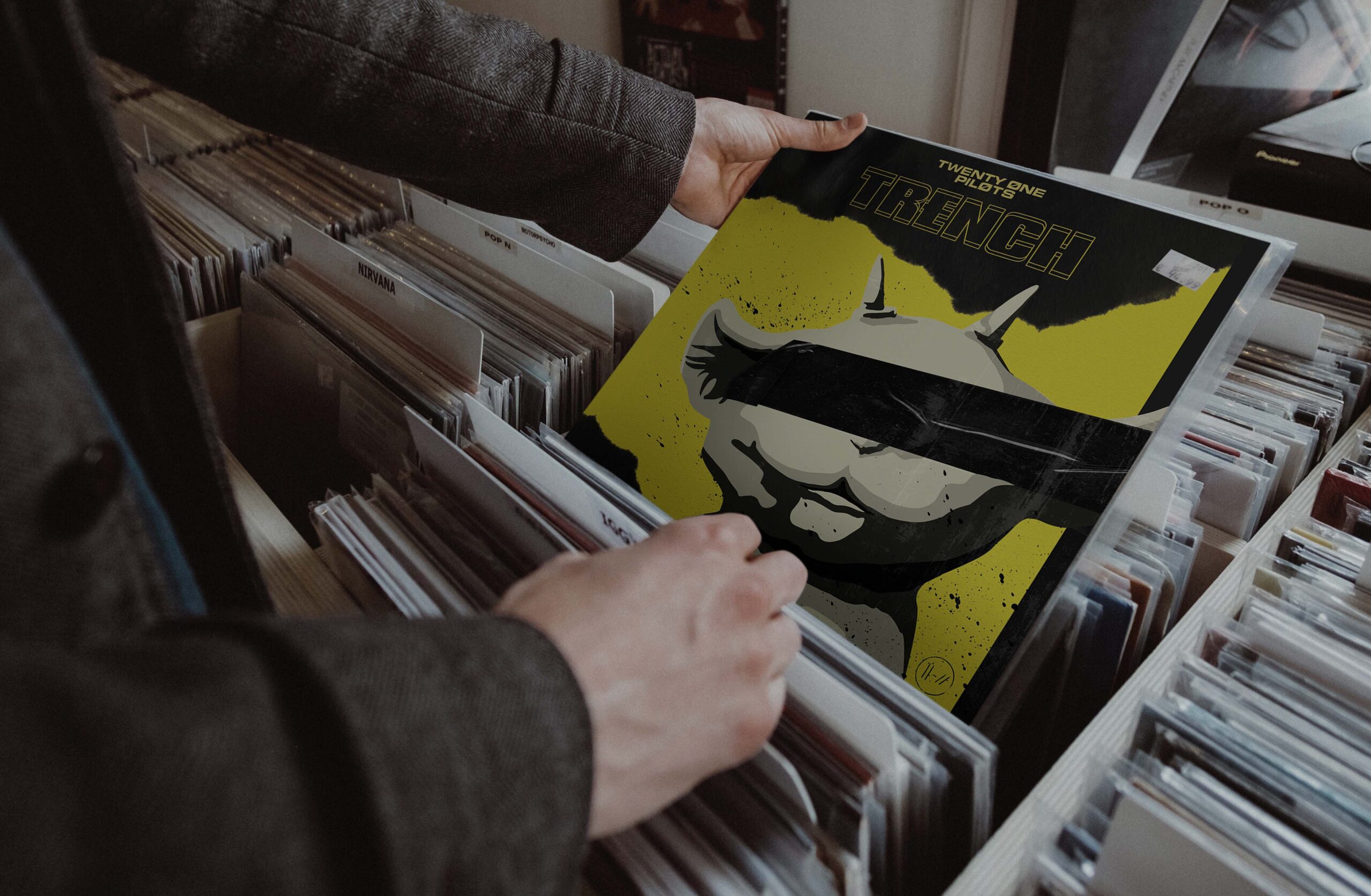
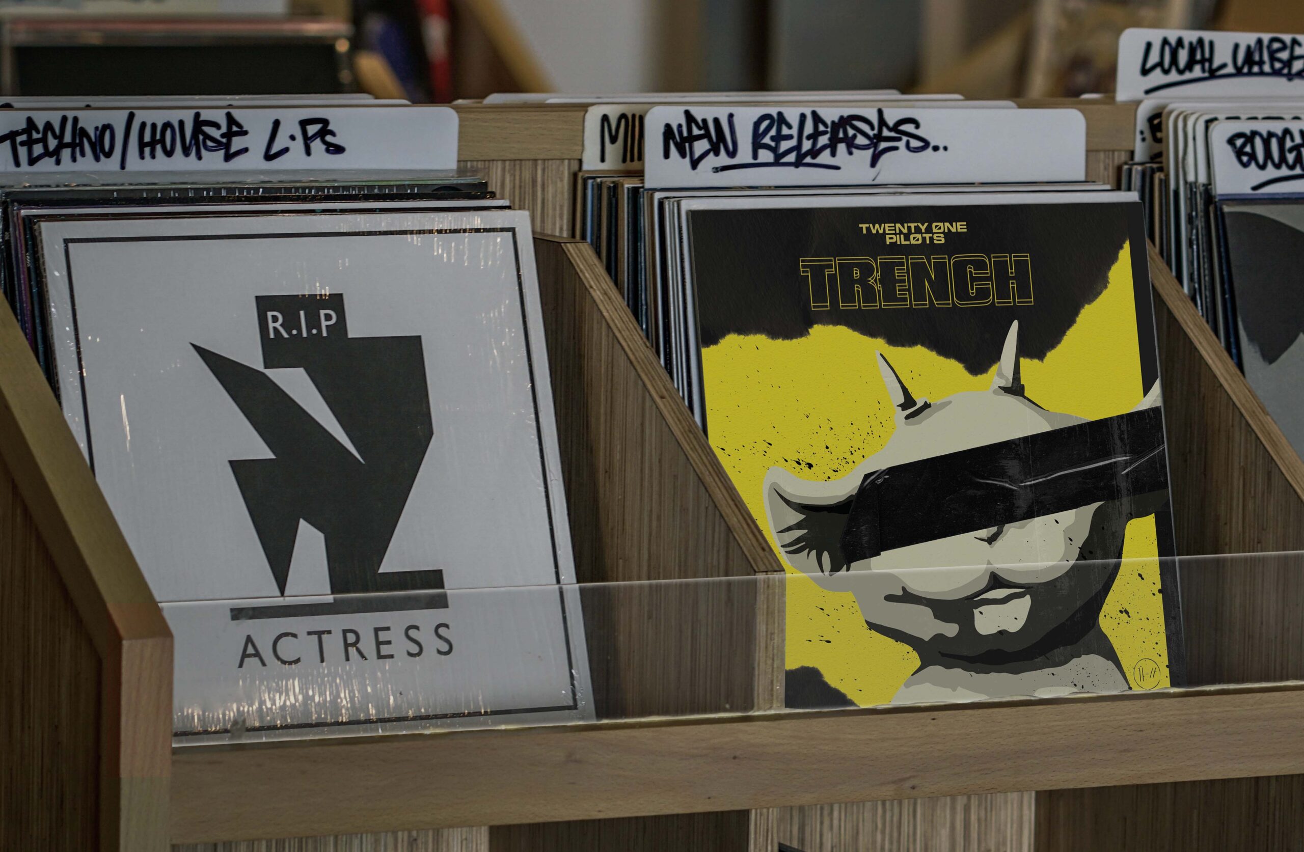
One of the first music videos that drew me into their world was Chlorine. It introduces Ned, a small, fuzzy creature who quietly follows the band throughout the story. As I explored the lore further, I discovered that Ned represents the band’s creativity. So from that point on, I knew he needed to be at the center of my cover design. 

Click here to watch one of their music Videos!

Design Choices

Continuing, the album cover that I created primarily conists of the color yellow. This is because the color represents hope, support, and protection. Within the album’s lore, this color is associated with the “Banditos,” who are a group of rebels trying to escape the oppressive city of Dema. Other than the yellow, I included the imagery of tape. This is because it represents rebellion and protection against the leaders of Dema named the “Bishops”.


From the inspiration prior, Ned was chosen as the center-piece for this album cover as I wanted to shed light onto an underrated character that is very important to both Tyler and Josh, a representation of their creativity and drive to create music. I strived to create a design that was grungy, but also incorporated a lot of important imagery within the Twenty One Pilots universe in a way that would connect old fans and create interest for anyone new.

This project pushed me creatively in the best way. Embracing a bold color palette, particularly yellow, encouraged me to experiment beyond my usual design habits. I felt a strong responsibility to honor a band that has influenced me for years, and despite the time constraints and evolving ideas, the experience proved both rewarding and meaningful. Ultimately, the effort shows in a final design I’m genuinely proud of.